

Right for Me App
Mint is best known as a budgeting tool aggregating financial data in one location. Extensive research, analytics, and time spent with Mint customers highlighted that numerous segments of customers existed, and each group only used certain features. We had customers ranging from young adults learning to manage their finances to establish financially secure adults needing a single view of their finances. To better serve each group and continually experiment with innovation, we set a goal to provide the flexibility for people to tailor the experience to their needs.
Challenge
Mint is currently a one size fits all app; not everyone uses every aspect of the service.
Mint can be overwhelming for customers when they first sign up.
Mint would like to bring customers in with a single value proposition and then expand the feature set as appropriate for the customer's financial situation.
Mint and Intuit want to be able to continually experiment with different solutions.
Intuit has many business/product organizations, many of which are trying to solve problems for consumers and want to introduce their features into the Mint experience.
Intuit is continually looking for ways to integrate Mint into the overall Intuit ecosystem to develop year-round consumer engagement.
All of these problems must be solved without breaking the customer's experience.
Role
Strategist ideating on potential solutions and direction to set a course for the product and teams.
Researcher
Principles
Customers can take action in 1 tap and understand the next layer of detail in 2 taps or less
Enable the customer to tailor the product to their needs- "Right for me."
Simplify finding what the customer needs to know
Must communicate mental model and prioritize top jobs to be done
Allow for experimentation without compromising the experience
Allow for ecosystem expansion without compromising the experience
Address successful monetization
Ideation
There were basically 3 approaches we could take, all using our existing card metaphor for each "Job to be Done":
Drawer navigation
Tab bar navigation
Combination of Drawer and Tab bar
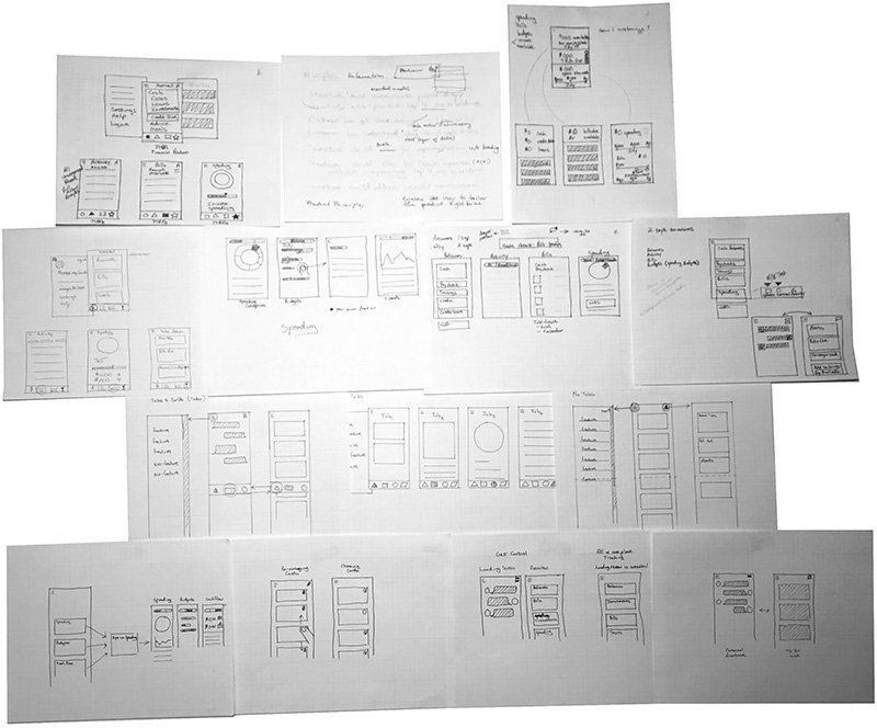
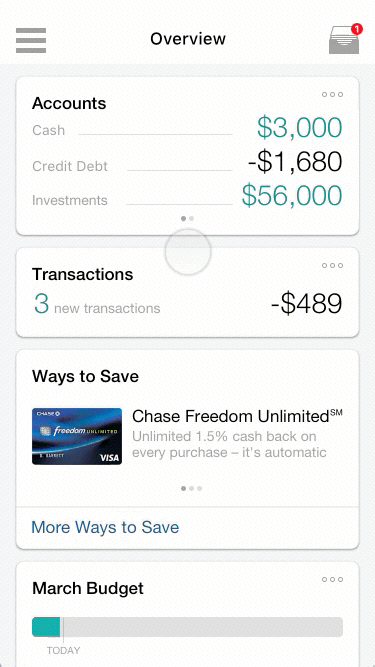
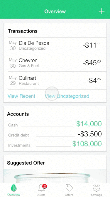
The Overview screen includes cards for each feature Mint offers in each approach. Based on observations of customers using the existing app, the cards are the primary navigation for customers. Rarely did customers look to the Drawer (Android) or Tab bar (iOS) to find their information. This lets the customer personalize which features are displayed on the Overview and in what order.
Supporting features like Alerts, Settings, Offers, etc., would be located in the Drawer or Tab Bar. This way, they would be constant in location.
The Drawer navigation (often known as a Hamburger menu) allows for flexibility without significant changes to where the customer would locate features. The downside of the Drawer is a proven reduction in engagement with items in the Drawer.
The Tab bar navigation typically includes the top jobs to be done; however, those would be the cards in the Overview. Implementing the Tab bar approach means locating supporting features within the tabs.
Prototyping Concepts
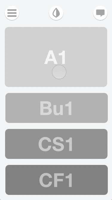
One of my initial prototypes included the following:
Floating navigation
Drawer for supporting features and configuration of the cards on the Overview screen
App switching menu to keep the ecosystem
Combination Chat UI and To Do list
Within the Chat UI, Mint recognizes a bill was paid late and suggests adding the Bills feature to help track and pay their bills on time.
A couple of versions later, the UI was cleaned up, using a more traditional navigation bar, and the app switching moved to the Drawer. Contextual settings are added so that the customer can manipulate settings and the positioning of cards right from the card. The downside is that the cards had to be manipulated one at a time.
The Drawer approach cleans up the UI allowing for the focus to be on content, but the downsides are that it's only available at the top level of the Information Architecture, and items in the Drawer are out of sight and out of mind.
With the Tab bar approach, you can tab to another area from anywhere in the app, maintain your position in the hierarchy when you return to a Tab, and items in your Tabs are always visible.
In comparing the Drawer navigation with the Tab bar approach, it became evident that the Tab bar's benefits outweighed those of the Drawer.
The next prototype incorporated the Tab bar, tested a single-screen approach to configuring the Overview Cards (two access points, contextual and in settings), and tried a global Add feature within the Tab bar.
This approach tested well. The location in Settings for configuring the Overview cards met most expectations of customers. The single-screen method for configuring cards clearly communicated what could be done while providing a picture of how all the cards related. The global Add feature in the Tab bar also tested well but didn't address a perceived problem for customers.
MVP Solution
For our MVP, we simplified the solution. It included:
Only the Settings location for Overview card configuration
Removing the global Add feature in the Tab bar
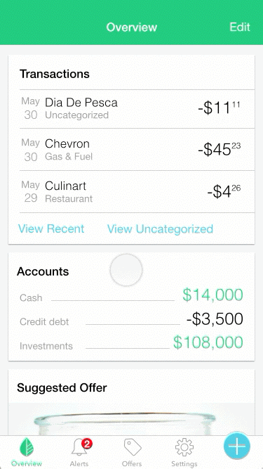
Combining the Overview and Updates tabs into a single card stack
Cleaned up the Transactions presentation and added filtering
Added an Alerts tab bringing all Alerts and Notifications into a single location
Outcomes
Before release, I ran the simplified design through a Time to Task Usability Study. The test measured success and time to completion for all of the top tasks in the new designs and the current app. The top 8 tasks that were measured included:
Categorize an uncategorized transaction
Check an account balance
Check for fraudulent transactions
See in which categories spending is occurring
See what budgets are over and under for the month
See when a bill is due
Check credit score
View alerts
Android
Test results comparing the new design with the current app:
Successful completion of 8 of 8 tasks
Time to complete task improvement in 6 of 8 tasks
Ranging from 4% to 89% faster
Overall improvement of 96.24 seconds for all tasks
iOS
Test results comparing the new design with the current app:
Successful completion of 8 of 8 tasks
Time to complete task improvement in 8 of 8 tasks
Ranging from 10% to 68% faster
Overall improvement in all tasks of 58.4 seconds.
All customers appreciated the simplification of the app and where features are located. Customers preferred the combination of cards and 4-tab navigation over the existing app, regardless of platform. Numerous observations regarding customers' mental models will be incorporated in subsequent releases.
"The new design is faster because almost every time in the existing app,
I had to flip from the Updates screen to my Overview”
"I wouldn't go, wow, this is the best thing I've ever seen in my life;
it's the same application… it's a better UI”
"Making it simpler saves me time”
Mint receives Android Excellence award
— Google (October 2017)